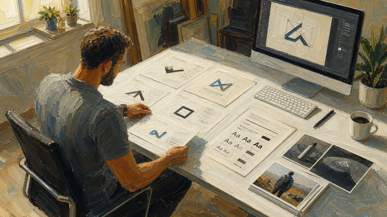
There are seven types of logo: wordmark, lettermark, pictorial, abstract, mascot, emblem and combination. Three of them account for most logos, and a start-a-business app like Draper starts every brand with a combination mark built from one of those three.
The type matters less than most founders think, and more than they expect in one specific way: it decides how much meaning your mark carries before anyone has heard of you.
| Choosing a logo type | The short answer |
|---|---|
| Types that cover most brands | Lettermark, pictorial and abstract |
| What to start with | A combination mark — the pictorial or abstract mark plus the name |
| Why start there | New brands need a square version and a wide version, and the wide one has to carry the name |
| The type to think hardest about | Mascot — only worth it if the character appears outside the logo |
| The type rarely worth it in 2026 | Emblem, unless the brand is genuinely aligned to an old-timey feel |
| Mascot use across businesses built in Draper | Fewer than 5% |
What are the seven types of logo?
Seven: wordmark, lettermark, pictorial, abstract, mascot, emblem and combination. The type describes how the mark is constructed — from the name, from initials, from an image, from a shape, from a character, from a badge, or from a pairing of mark and name.
Each carries a different amount of borrowed meaning, and that is the property that decides which one suits a new brand.
| Logo type | What it is | When it works |
|---|---|---|
| Wordmark | The full brand name set in a distinctive typeface | The name is short, distinctive and worth reading in full |
| Lettermark | The initials, usually in a custom or brand-specific typeface | You want a premium feel, or the full name is long |
| Pictorial | A recognisable image — an object, an animal, a thing | You want the mark to carry meaning immediately |
| Abstract | A shape that does not depict anything specific | You want a distinctive mark and can afford to give it meaning over time |
| Mascot | A character that represents the brand | The character will appear in your content, not only in the logo |
| Emblem | The name locked inside a badge, crest or seal | The brand is genuinely aligned to a heritage or institutional feel |
| Combination | A pictorial or abstract mark paired with the name | Almost every new brand — it gives you a square and a wide version |
Which logo types do most brands actually use?
Lettermark, pictorial and abstract account for most logos, and most new brands are best served by one of those three paired with the name as a combination mark. That gives you a square version for profile pictures and app icons, and a wide version for anywhere the audience does not know you yet.
The other four are not wrong, they are narrower: a wordmark needs a name worth reading in full, a mascot needs a character you will actually run, and an emblem needs a brand that suits a badge.
That collapses a seven-way decision into a three-way one. From there the choice is mostly about how much meaning you want the mark to carry on its own, and how much you are prepared to build.
Everything below assumes the brand decisions are already made. If they are not, our guide on how to design a brand for a new business idea is the step that comes first.
Why does Draper start every brand with a combination logo?
A combination logo pairs a pictorial or abstract mark with the brand name. Draper starts every brand with one because new brands need both versions: a square lockup for profile pictures and app icons, and a wide one carrying the name for audiences who have never heard of you.
That second version is the one founders forget. A bare mark works when people already recognise it. For a brand nobody knows, a mark on its own is a shape — the name has to be attached, or the impression is wasted.
Starting with the combination gives you both and lets you drop back to the mark alone later, once recognition exists. Going the other way means redoing the work at the moment you can least afford it.
What does a pictorial logo do that an abstract mark cannot?
A pictorial mark is a recognisable thing and an abstract mark is not. That difference is the whole choice: a pictorial borrows meaning from the image, so a lion arrives already carrying bravery. An abstract mark carries nothing until you spend the time and money to teach people what it stands for.
There is more implicit context in the choice of image than most founders realise, and it works at two levels. The subject borrows a reputation — a lion for bravery, a mountain for permanence. The art style says something too: a minimalist treatment reads as a brand confident enough to remove things.
Pictorial marks are easy to remember and quick to capture the spirit of a company, which is why Draper recommends them often.
When is a lettermark the right choice?
A lettermark reduces the brand to its initials, and it reliably produces a premium feel. It also gives you an unusual amount of consistency: build a typeface exclusive to the brand, then cut the lettermark from that same typeface, and every piece of text you set afterwards is already on-brand.
That sequence is the reason to take it seriously. The mark and the typography stop being two decisions and become one, which is difficult to achieve any other way.
Draper can create the brand typeface and then build the mark from it. Doing it by hand is a type-design job — achievable, but a different order of work from choosing a mark.
Should you use a mascot logo in 2026?
Only if you intend to use the mascot outside the logo. A mascot works when it appears in your content doing things — reacting, demonstrating, showing up in different poses. Fewer than 5% of businesses built in Draper use one. If you want an animal in your logo but no character to run, you want a pictorial mark.
That is the whole test, and it is a test about your content plan rather than your taste. A mascot that only ever sits in the corner of a website is a pictorial mark with extra drawing work attached.
Used properly it is one of the strongest identity assets available, and it travels across levels of formality and eras in a way other types do not. Duo, the Duolingo owl, is the clearest example of a mascot brought to life rather than parked in a logo.
Why are emblems hard to justify in 2026?
Emblems lock the name inside a badge, crest or seal. They carry an old-timey, premium feel, and they also carry the baggage of large corporations, car manufacturers in particular. Draper almost never recommends an emblem once it has analysed a brand — the exception is a brand genuinely aligned to that heritage feel.
There is a practical problem too. An emblem is a single unit, so the name cannot be separated from the badge. At small sizes — a favicon, an app icon, a profile picture — the whole thing shrinks together and the name becomes unreadable.
If the heritage feel is genuinely right for the brand, an emblem does it better than anything else. That is a narrow case, not a default.
What choosing a logo type will not settle
Picking a type does not give you a brand. The type is a construction method; the decisions that make a mark work — who this is for, what you promise, how you sound — sit upstream of it, and a logo drawn before those exist will be redrawn once they do.
It also does not settle whether the mark is yours to use. That is a separate check, and our guide on whether you can trademark a business idea covers what registration protects and what it does not.
The order that works: settle the brand, choose the type that suits it, then draw it.
Related questions
The type sits inside the brand work — how to design a brand for a new business idea covers the references and decisions that make the choice obvious. For the full sequence a start-a-business app runs, see what Draper actually does.